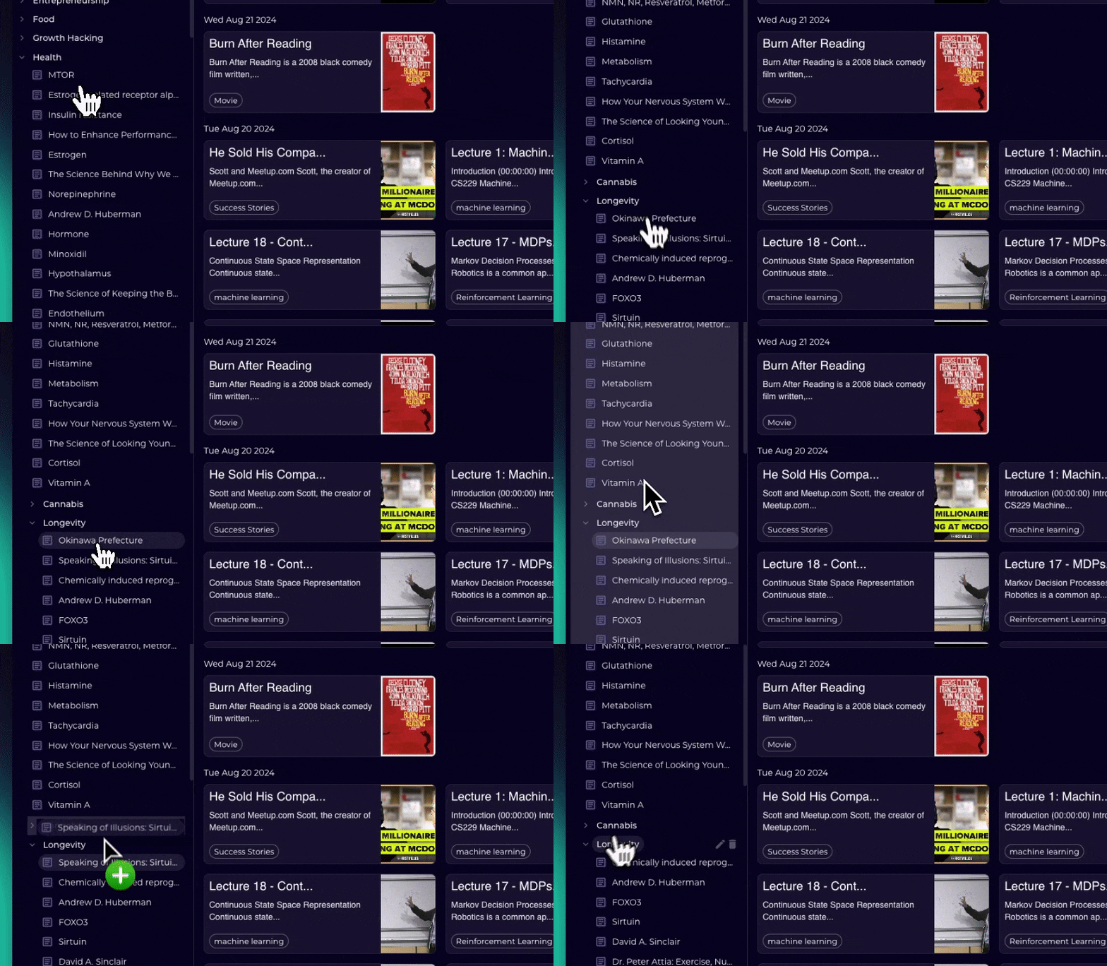
We released a few touchups to our UI for a more intuitive navigation of the Recall Knowledge Base. This is just the first step in a series of UI improvements.
1. Drag and Drop:
You can now drag and drop cards in the left hand panel navigation to effortlessly organize your cards. 
2. Adding New Content
: A seamless way to ingest new content into Recall: Click the "New" button in the top right corner of the app to add new content into Recall:- Pasting a URL of any online content / adding content through wikipedia
- Creating a blank card
- Importing your bookmarks.
There is a lot more to come here as we plan to focus on more ways to bulk import content into Recall.
3. More Sorting Options:
We added the ability to sort cards in ascending / descending order. 4. Three ways to view your Knowledge Base:
In the top left corner you can switch between different ways to view your knowledge base. - Home: This is the default card view.
- Graph: This is the visual representation of the underlying infrastructure that connects all your knowledge together. Select a tag in the left hand panel to further filer your graph.
- Review: This switches to the "Recall Review" which creates a schedule to review the cards that you have generated questions for on a personalized schedule.